
We mark your brand.

CLIENT:
Pentru Tine
INDUSTRY:
NGO
LOCATION:
Botoșani

Pentru Tine is a nonprofit organisation from Botoșani that has supported thousands of children, vulnerable families and communities facing difficult situations. Unlike most of our commercial projects, this rebranding had to communicate a deeply human and faith led mission, while helping the organisation become more visible, recognisable and easier to support.

Strevis worked on a complete rebranding, creating a new identity, communication direction and visual system for the organisation and its projects.

  • #rebranding
  • #illustrations
  • #socialmedia
  • #copywriting
  • #graphicdesign
  • #motto
  • #UI/UX

The Challenge

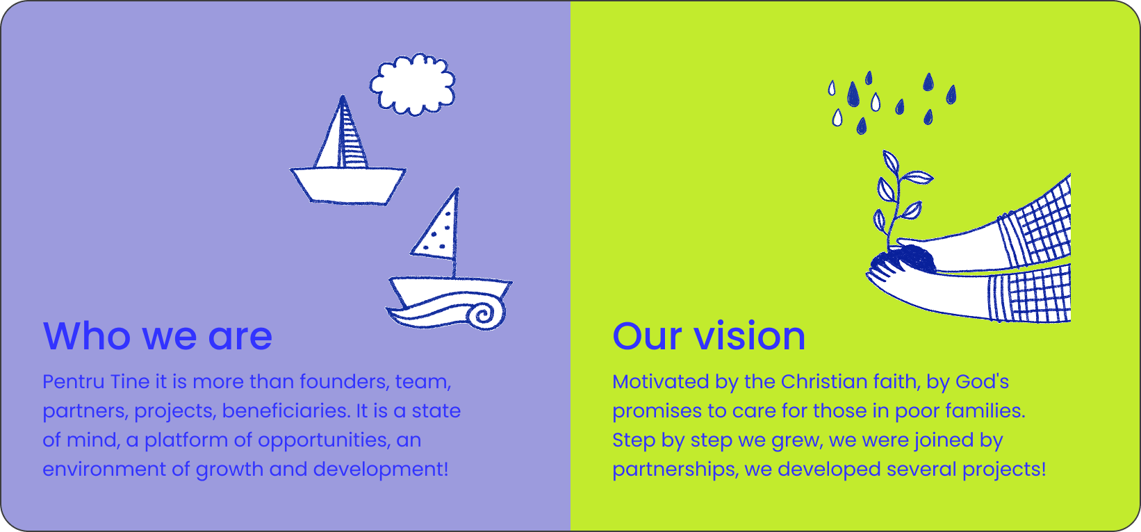
Pentru Tine it is more than founders, team, partners, projects, beneficiaries. It is a state of mind, a platform of opportunities, an environment of growth and development!

Motivated by the Christian faith, by God's promises to care for those in poor families. Step by step we grew, we were joined by partnerships, we developed several projects!

Pentru Tine deals every day with difficult realities, from vulnerable children and families to communities that need urgent support. We did not want the brand to add even more sadness to these already difficult stories.

The challenge was to create something completely different: fresh, bright and full of life. The identity had to bring hope and positive energy, while still respecting the seriousness of the organisation’s work. Since Pentru Tine runs several projects, we also needed a clear system that could give each one its own personality while keeping them connected to the main brand.

Our approach

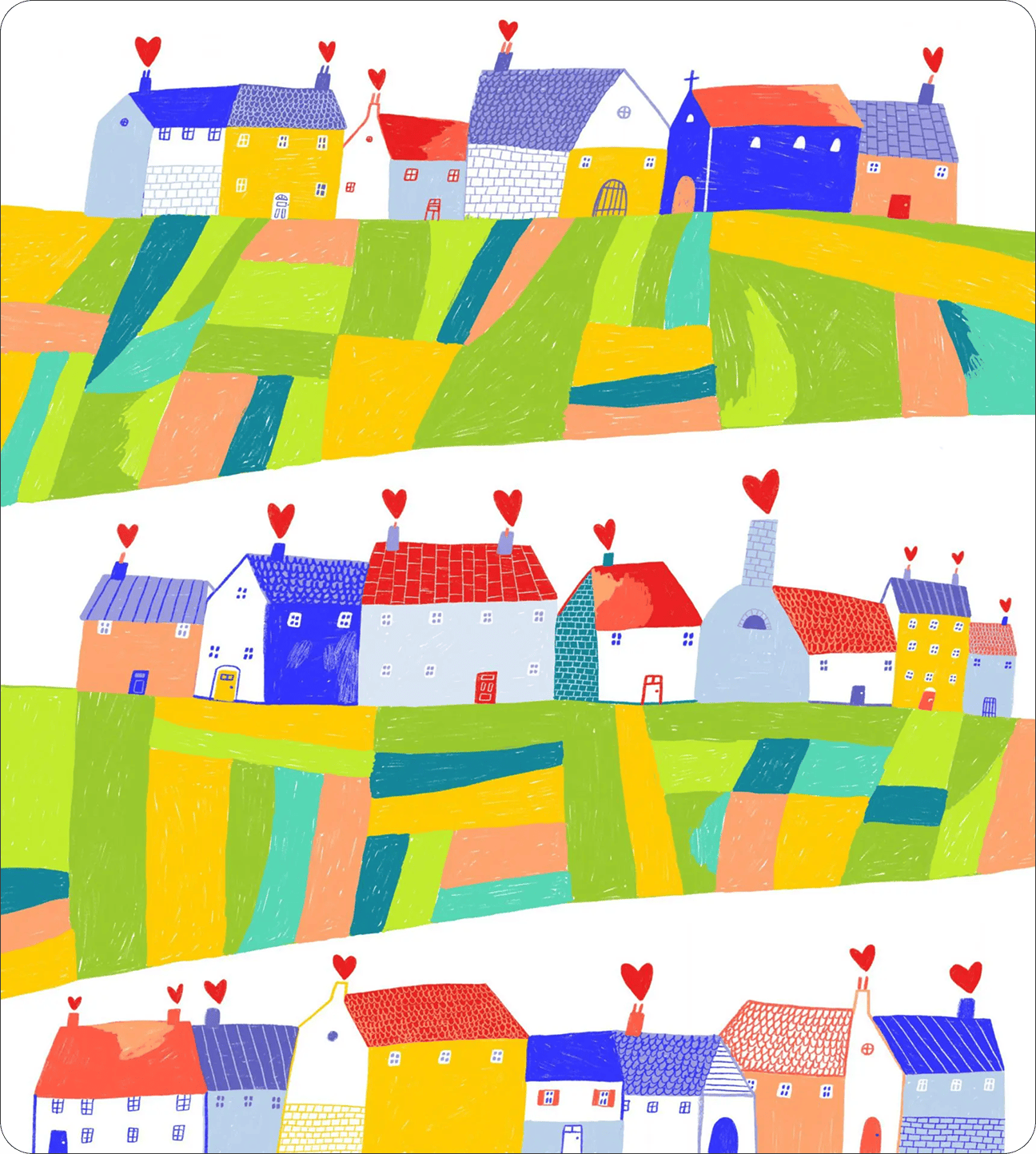
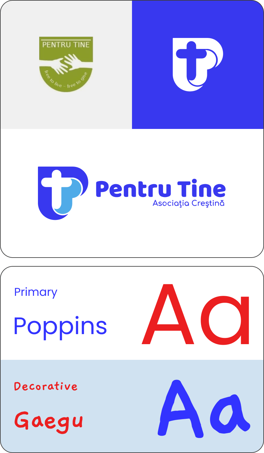
We built the new identity around hope, energy and human connection. Bright colours, bold shapes and a warmer tone of voice gave Pentru Tine a fresh visual presence, while each project received its own colour to make the system easy to recognise and use.

The new motto, “From Christ, with love, for you,” brought the organisation’s mission, values and faith into one clear message. Closely connected to the logo and the visual identity, it became the central idea of a brand created to inspire trust, optimism and action.

A New Challenge

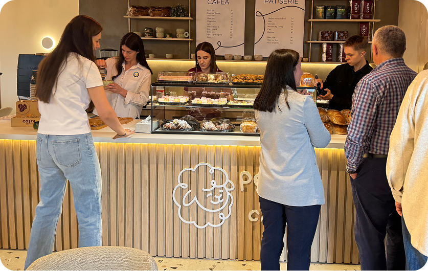
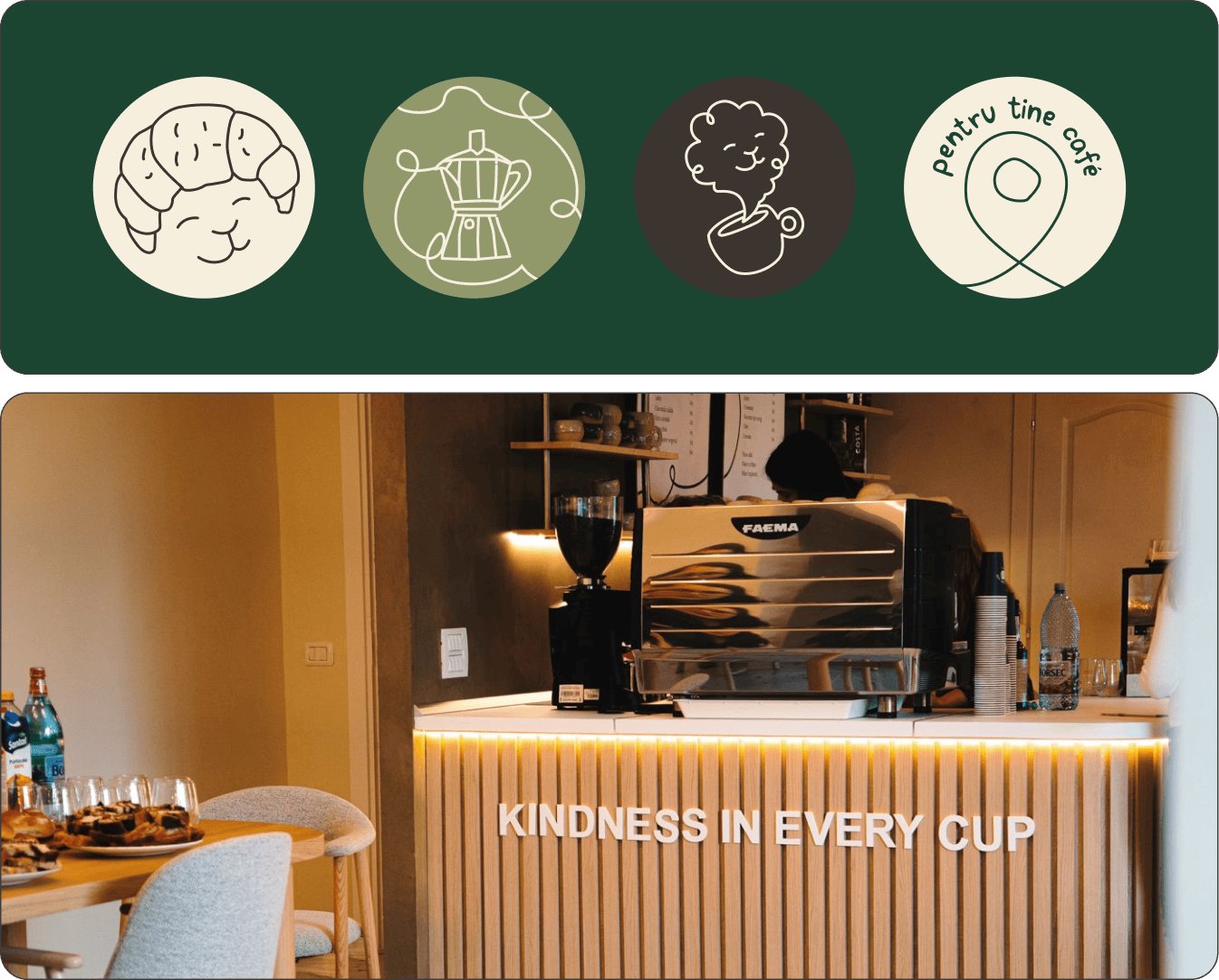
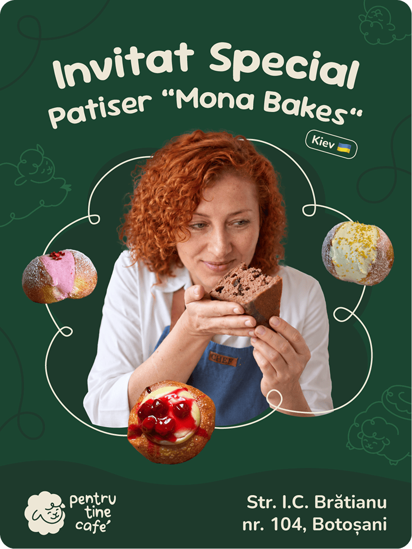
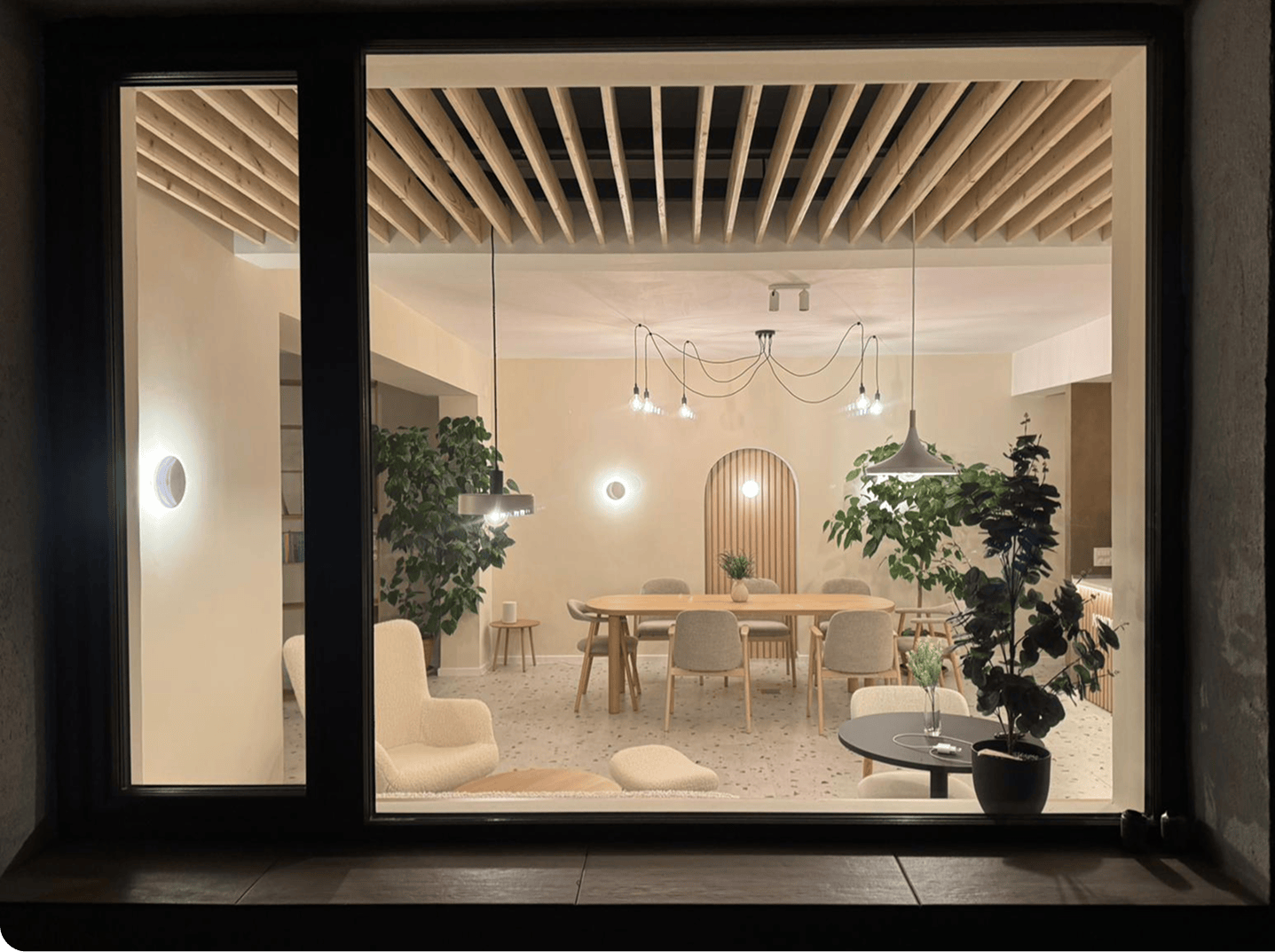
Pentru Tine wanted to create something new: a social café where good coffee, community and purpose could naturally come together. Not simply an extension of the association, but a place with its own personality, one people would genuinely want to visit, enjoy and return to.

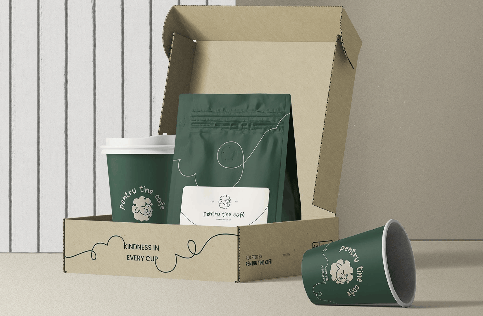
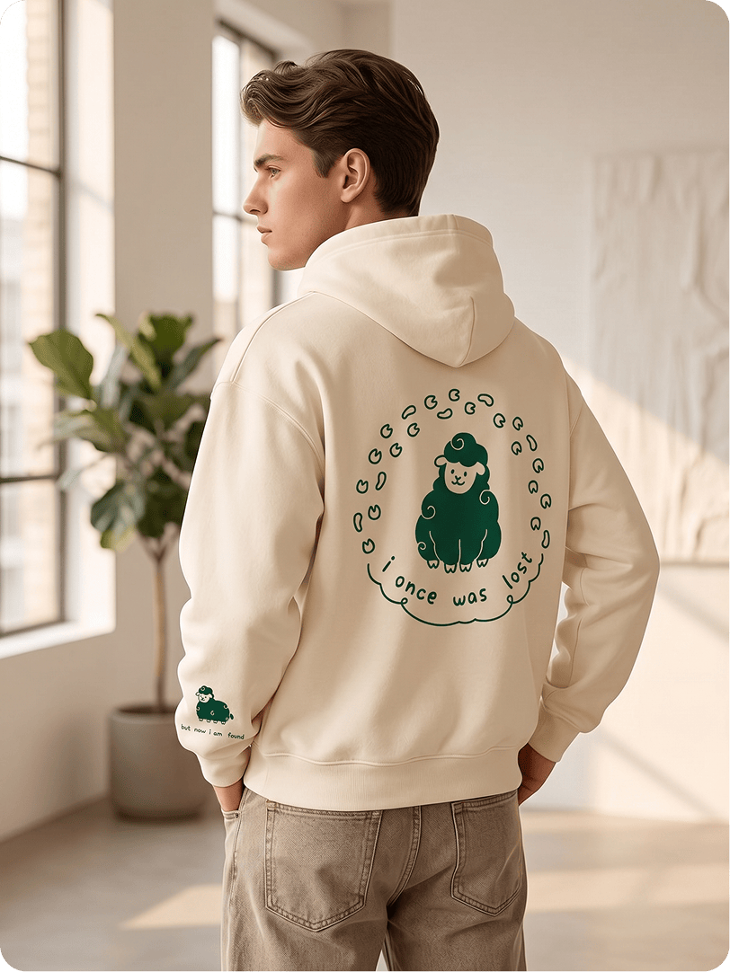
Strevis joined the project pro bono to build the brand from the ground up: naming, positioning, concept, visual identity, motto, packaging, overall mood and, currently, merch. The goal was to create something that felt warm, contemporary and approachable, without losing the deeper purpose behind the project.

Kindness, Built Into the Brand

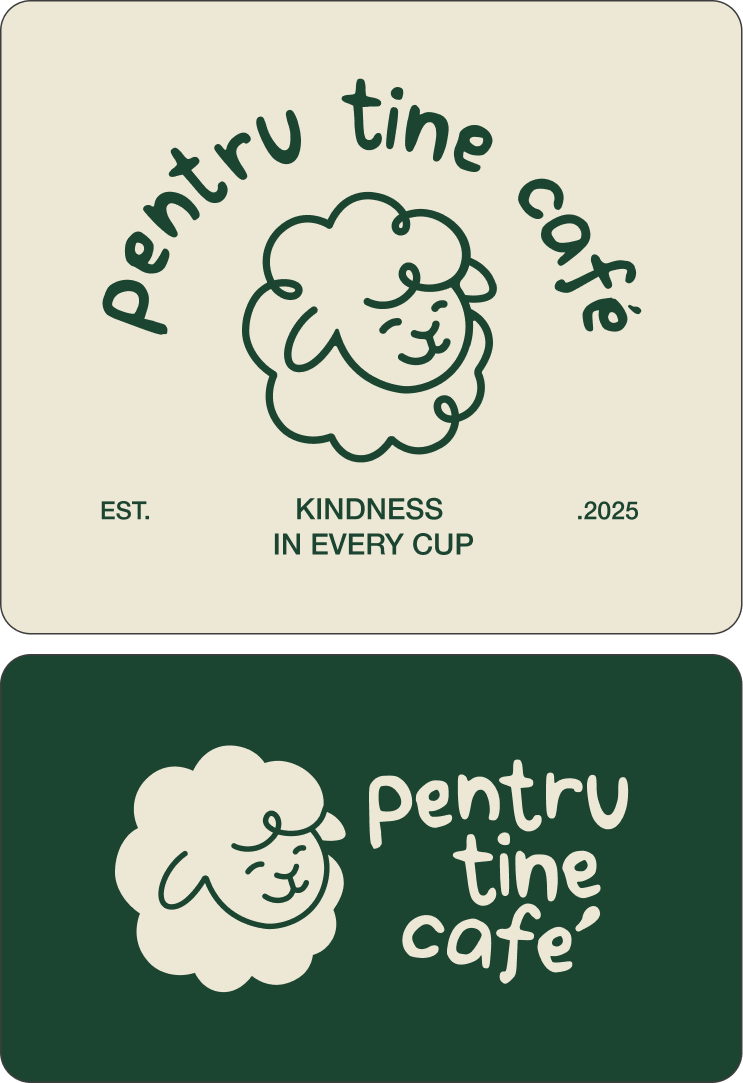
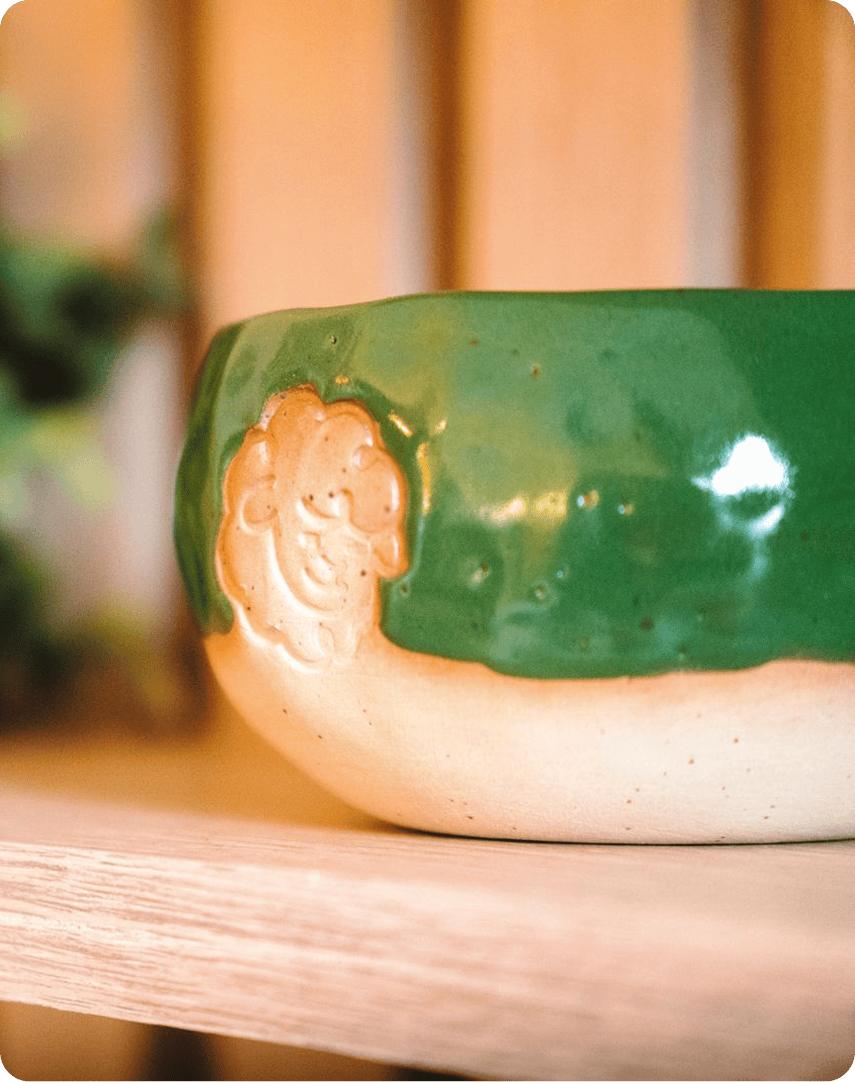
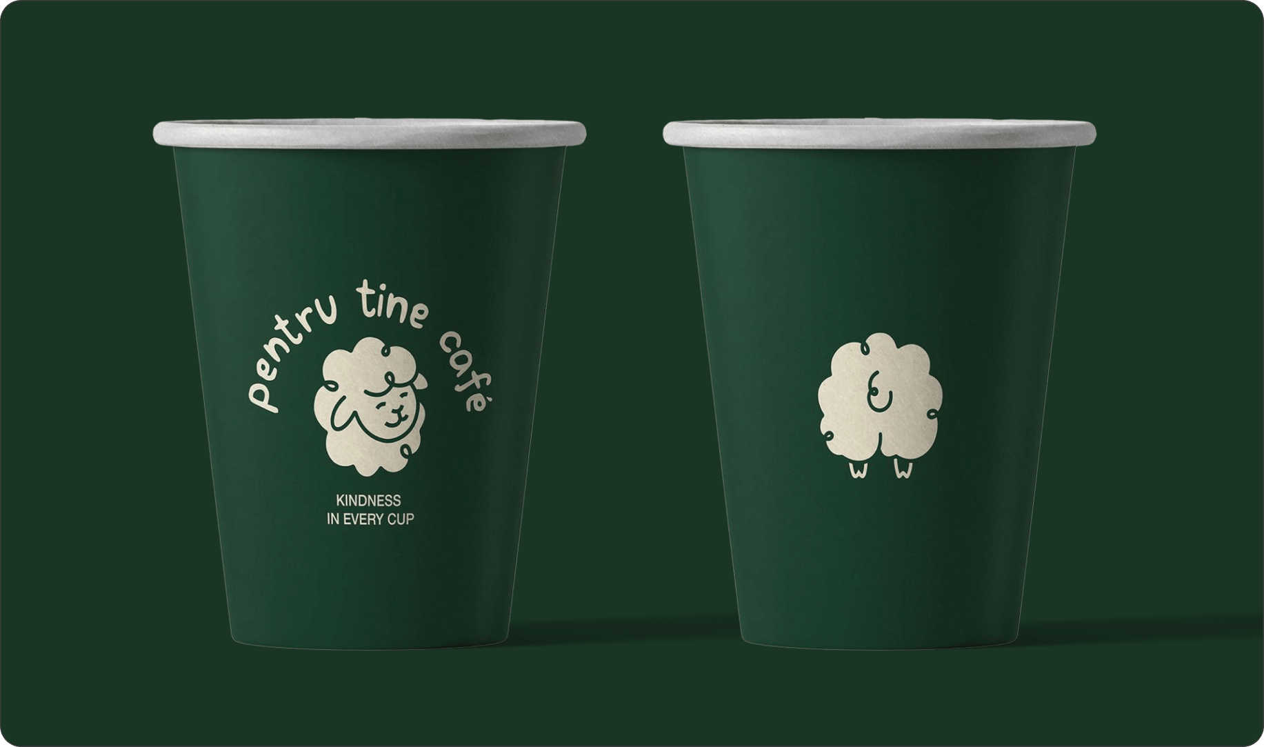
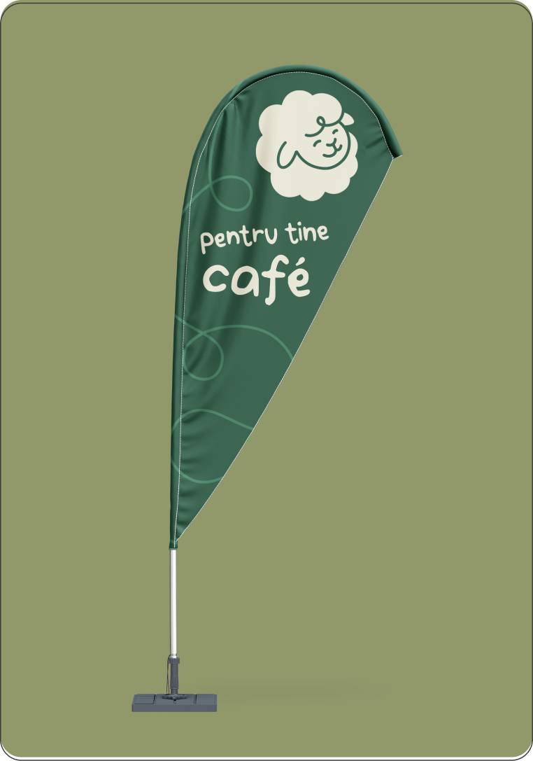
At the heart of the identity is the sheep mascot. Rooted in Christian symbolism, the sheep represents community, care, protection and gentleness. Ideas that naturally connect with the spirit of Pentru Tine. Its soft, friendly character also helped give the café a warmer, more distinctive personality.

The result is a social café that does not rely only on its mission to be meaningful. It has a character of its own: playful, welcoming and built around one simple idea: “Kindness in every cup.”